What makes a good UI/UX design? The 8 golden rules for better user interface & experience design.
If you develop digital products - whether as a developer, product manager or in the design team - you know the dilemma: users should find their way around immediately, navigate intuitively through the application and be happy to return at the end. But what sounds simple on paper is often complex in practice.
This is exactly where the 8 golden rules for better user interface design come in. They help you to avoid typical pitfalls, create clear structures and design interfaces that not only work, but also feel really good.
And as a bonus, we'll introduce you to the 6-3-1 rule - a surprisingly effective concept that will help you sort ideas faster, make better design decisions and lead your team to the goal more efficiently.
Why you should pay more attention to UI/UX design
Technically clean software is worthless if nobody understands or can use it. This is exactly where user interface design (UI design) comes in. It determines whether people can cope with your application, whether they are guided efficiently to their goal and whether they feel good about it. UI design is more than just "looking good" - it is a question of functionality, clarity and user-friendliness.
Good interface design is therefore more than just pretty looks - it is the key to a successful user experience. When design, function and user needs work together, interaction with digital products becomes easier and more pleasant for the user.
Particularly in the IT environment, where applications often map complex processes, the interface must provide orientation and avoid frustration - with user experience design serving as the basis for successful interface designs. Good UI design reduces support costs, improves the conversion rate and strengthens trust in your brand.
In this article, we will show you Ben Shneiderman's eight proven rules - supplemented by tried-and-tested tips, visual principles and answers to frequently asked questions: What is the 6-3-1 rule? What does a good color ratio look like? And what belongs in a UI concept?
Rule 1: Strive for consistency - internally and externally
One of the most important rules in UI design is: be consistent. Consistency means that similar elements behave and look the same - within an application and in comparison to other digital products.
For example, if you use green buttons for confirmations on one page, this should remain the same throughout the entire application. Don't suddenly use blue buttons for the same function on a subpage - this confuses the user and leads to errors. The terms you use in the interface should also be consistent. Don't say "user account" on one page and "profile" on another if they both mean the same thing.
Consistency reduces the cognitive load. It ensures that users feel safe - because they know what to expect.
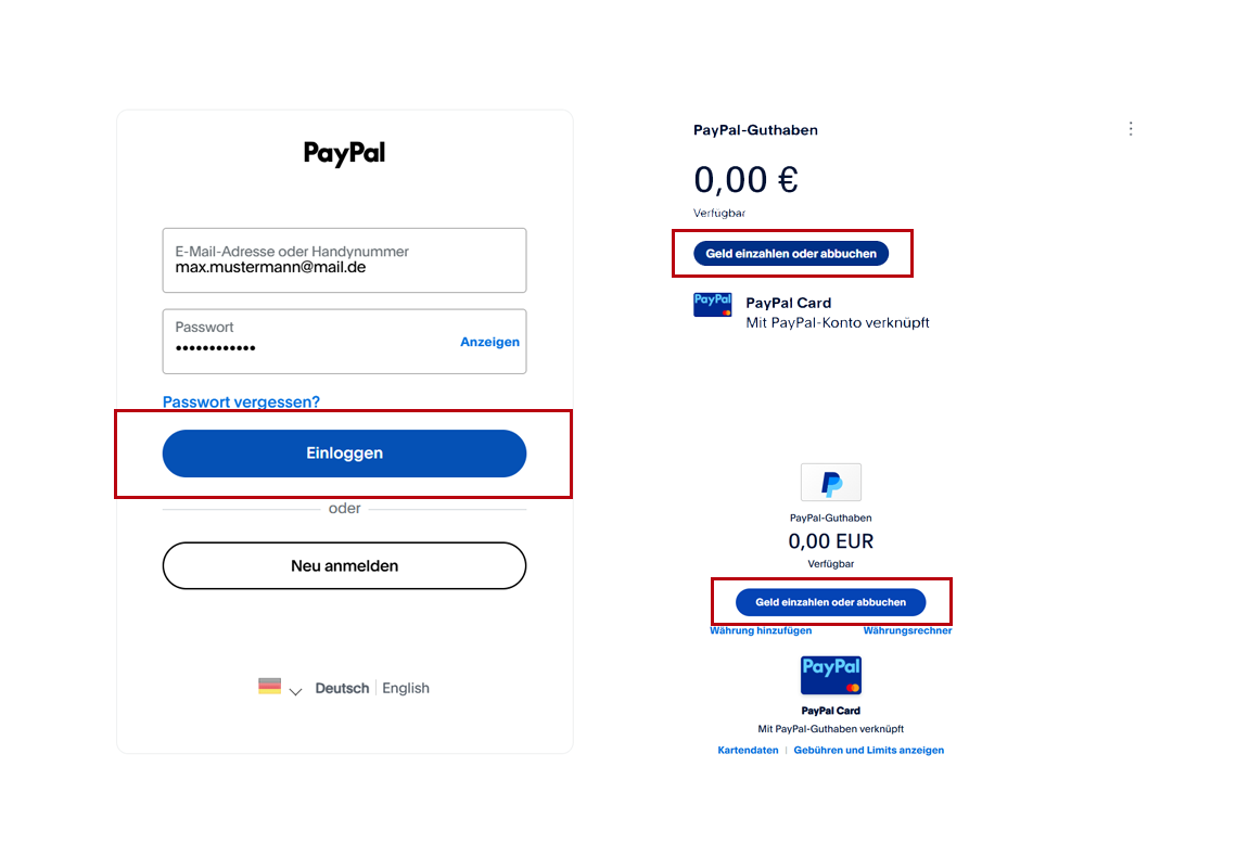
Beispiel für Konsistenz im UI von PayPal
Rule 2: Make your design accessible and barrier-free
Ben Shneiderman's second golden rule emphasizes how crucial it is to design user interfaces in such a way that they are accessible and understandable for as many people as possible. Universal usability means that a user interface not only works for experienced users or technology professionals, but also for beginners, older people or people with disabilities. The aim is to create a user interface that does not exclude anyone and enables everyone to have a positive user experience.
A central element of this is accessibility. Modern websites and applications should be designed in such a way that they can also be used by people with visual or hearing impairments, motor impairments or cognitive disabilities without any problems. This can be achieved, for example, through alternative texts for images, sufficiently high color contrasts, understandable language and the ability to operate all functions using a keyboard.
Accessible design is not just a question of user-friendliness - it is also a legal requirement: accessibility will become mandatory for many digital offerings when the German Accessibility Improvement Act (BFSG) comes into force in June 2025 at the latest. Companies that do not design their digital products accordingly risk not only a loss of user satisfaction, but also legal consequences.
A well thought-out UI design that takes accessibility into account from the outset therefore not only improves usability - it also strengthens legal security and opens up access to a broader user group.
For UI designers, this means that the diversity of users should always be kept in mind when creating user interfaces and UI designs. A well thought-out interface design that focuses on universal usability not only increases user satisfaction, but also makes websites and applications future-proof and competitive.
Ultimately, everyone benefits - because an inclusive, consistent and user-friendly user interface is the basis for any successful digital service.

jobs.fida.de klassische Darstellung

jobs.fida.de Darstellung mit höheren Kontrasten und ohne Hintergrundvideo für weniger Barrieren
Rule 3: Give the user immediate, informative feedback
Imagine you click on "Save" - and nothing happens. No sound, no movement, no confirmation. You don't know whether your action was successful, whether the system has responded or whether an error has occurred. It is precisely this feeling of uncertainty that a good UX design must prevent. The status of the system should always be displayed to the user as feedback so that they know what state the program is in and whether their action is being processed.
Every user action needs a visible or audible reaction. This does not mean that every action has to be loud or intrusive - but that the user always knows whether the system has recognized their input and what the current status is.
For example, a button should change color slightly or rise slightly when hovered over by the mouse pointer. This signals: "You can click here." When actually clicking, on the other hand, the color should not necessarily change, but a loading indicator or status message should appear. Because if a button suddenly turns green when clicked, for example, this could be confusing - especially if this color is otherwise used for success messages.
Example:
Hover state: button becomes darker or gets a shadow (signal: interactive).
Click state: short animation effect (e.g. click into place), then loading indicator or success message.
Success: After the click, the system shows: "Saved" or "Sent successfully" - ideally green and with an icon.
The more important the action, the clearer the feedback should be. A short button effect is sufficient for a simple click, but for far-reaching actions - such as deleting data - the interface must offer additional security. Users should know exactly what is happening and have the opportunity to reconsider their decision before irreversible consequences occur.
Microsoft Word provides a good example of this: if you want to close an edited document without having saved it, a clear message appears in the form of a dialog box. The question is: "Do you want to save the changes to 'Document1' before you close?" - with the three options Save, Do not save and Cancel. This prompt protects against data loss, makes the consequences of the action clear and gives the user full control. At the same time, Word uses this simple dialog to show what effective, situation-dependent feedback can look like.
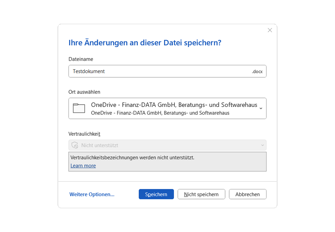
Aufforderung zum Speichern in Microsoft Word
Rule 4: Structure processes with a beginning, middle and end
An interface should present processes as clearly recognizable sequences - with a starting point, a recognizable progression and a clear conclusion. This is crucial for orientation and trust, especially for multi-stage processes such as orders, configurations or onboarding.
If a user does not know which step they are in or whether an action has been successfully completed, the abandonment rate increases. You should therefore structure processes visually - for example with progress indicators ("Step 2 of 3") or clearly visible confirmation pages after completed processes. Clearly structured dialogs between users and the system also help to make the individual steps of a process understandable and comprehensible.
Atried and tested element in this context is breadcrumbs - i.e. a path navigation that indicates the level at which the user is currently located (e.g. Home > Products > Product A > Configurator). Breadcrumbs provide orientation, reduce the cognitive load and allow the user to return to a higher level at any time. Especially for deeply structured pages, form processes or complex web applications, this navigation is a useful addition to classic menu navigation.

Beispiel für ein Breadcrumb Menü
Rule 5: Avoid errors - or help correct them
The best error message is the one that doesn't have to appear. Good UI design prevents typical errors before they even occur. This starts with the avoidance of invalid entries through input aids (e.g. automatic formatting for telephone numbers), deactivated options in the selection menu (e.g. grayed-out unavailable filters or unavailable products as an example of error prevention) and extends to precisely formulated error messages if something does go wrong.
The important thing is: if an error occurs, the user must not be left alone. They need to know:
What went wrong?
Where is the error?
How can I fix it?
An "Invalid value" does not help anyone. Better: "The zip code may only consist of 5 digits." It is best if the feedback appears immediately while the user is typing - not only after clicking on "Next".
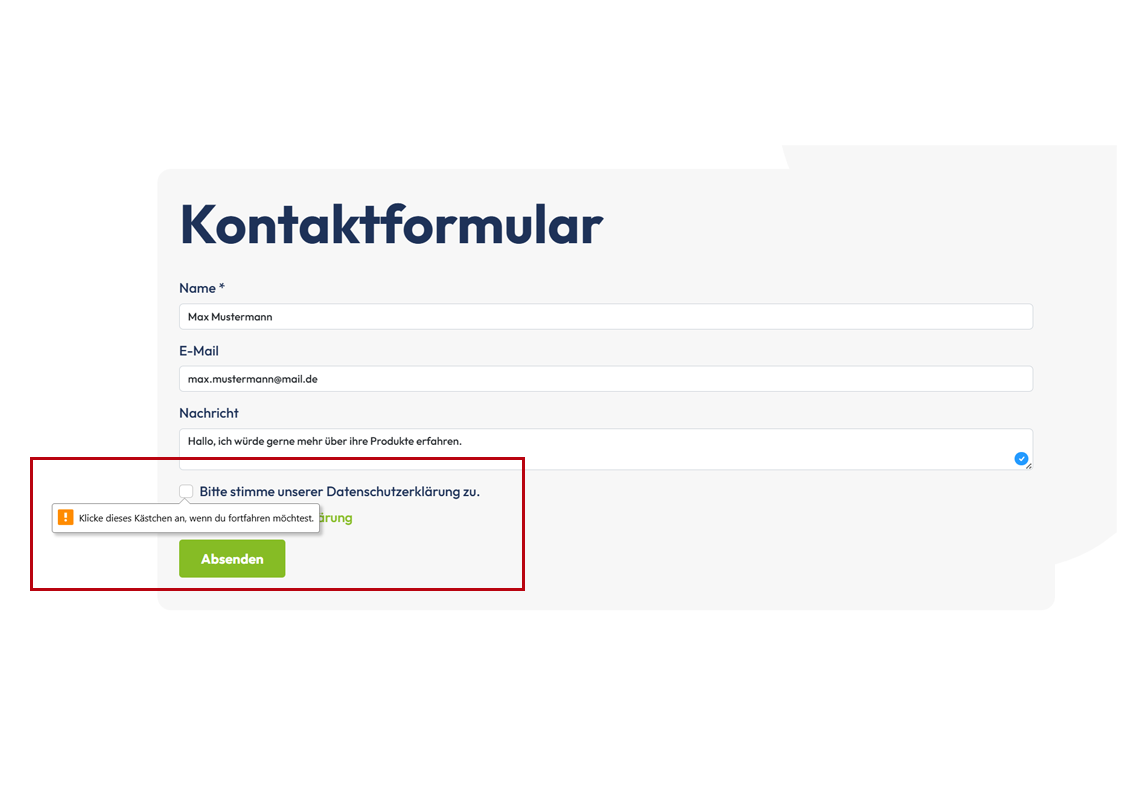
Fehlermeldung bei fehlendem Opt-In
Error prevention through deactivated options
A good example of proactive error prevention can be found in many online stores. If certain product variants - such as a color or size - are not available, these options are already greyed out in the selection menu. For example, if a user selects a smartphone model in a configuration for which the color "red" is not available, it is not even displayed as a selectable option. A small note such as "Currently not available" explains this immediately. This prevents the user from receiving an error message when sending the order - the error is virtually neutralized in advance.
Precise error messages instead of guesswork
Many web forms give blanket feedback such as "Field incorrect" if an incorrect entry is made. But these rarely lead to a solution. It is much better if the system tells you exactly what is missing or incorrect. For an email address without an "@" sign, it should not say "Invalid value", but rather: "Please enter a valid email address in the format name@beispiel.de." This allows the user to correct the entry.
Dynamic feedback during input
Immediate feedback is particularly effective for sensitive entries - such as choosing a password. Many applications now show in real time whether a password meets the security requirements. While the user is typing, messages such as:
"✓ At least 8 characters"
"✓ Contains a number"
"✗ Does not contain any special characters"
Only when all criteria have been met does the message change to "Secure password selected". This form of feedback is particularly user-friendly, as it provides guidance in real time and prevents the user from finding out what was wrong until after a failure.
Conclusion:
Error messages should not only be technically correct, but also understandable, contextual and helpful. The earlier a problem is identified and communicated, the better. And the clearer the feedback, the faster the user will be able to act again. This results in smooth, frustration-free interactions - even in the event of an error.
Rule 6: Allow actions to be reversed
A major trust factor in digital systems is the ability to reverse entries or actions. If users know that they can safely correct mistakes, they feel safer - and are more willing to try out new functions.
Whether "back" buttons, "undo" functions or a cache for entries: any form of reversibility increases control. This is therefore a central element of user control, as it enables users to control processes in a targeted manner and prevent unwanted automatic changes.
A warning is also particularly helpful in the case of actions that cannot be reversed ("This process cannot be reversed - continue?"). This conveys respect for the user - and avoids annoying misunderstandings.
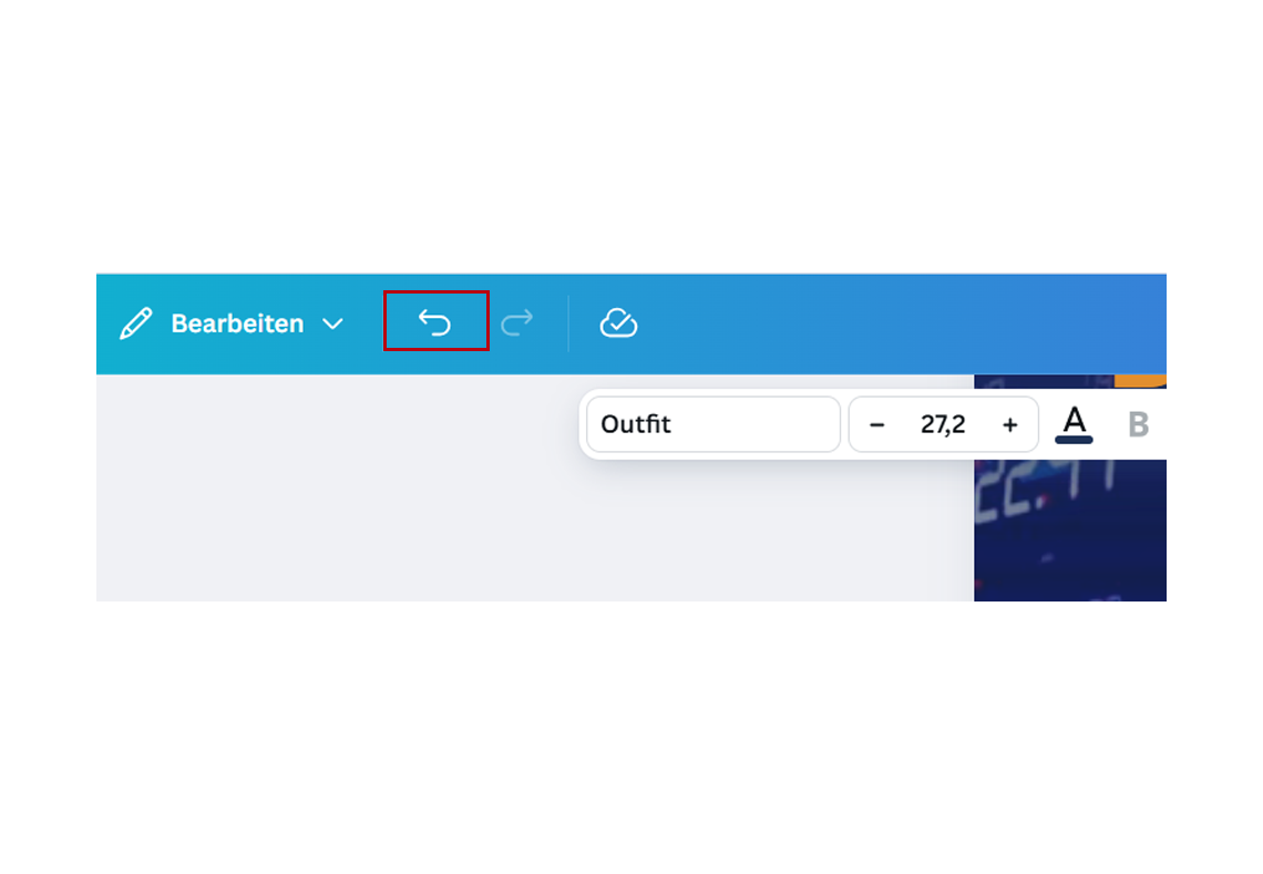
Rückgängig Funktion im Grafik Tool Canva
Example: "Recycle bin" instead of immediate deletion
A typical example of good reversibility is the recycle bin in operating systems such as Windows or macOS. When a user deletes a file, it is not removed immediately but moved to the recycle bin. The deletion process is only finalized by the deliberate action "Empty recycle bin".
The system thus signals: "You can think it over again." This creates security - and a mistake can be undone with just a few clicks.
Web applications are also increasingly relying on this principle. Many email services such as Gmail offer a short period of time after sending (e.g. 5-30 seconds) in which an email can still be stopped by clicking the "Undo send" button. Such functions may seem small, but they have a big impact on trust in the application.

Die Papierkorbfunktion gibt dem Nutzer Sicherheit
Rule 7: Give the user a feeling of control
A good UI always conveys: You are in control. The interface reacts to your decisions - not the other way around. The interface plays a central role in this because it enables and shapes the interaction between the user and the system and thus ensures that you actually remain in control. Nothing happens automatically without you initiating it. There are no unexpected redirects, no pop-ups that open on their own and no forms that send themselves.
Instead, you control what happens and when - and the system makes the current status transparent. This principle is particularly important for security-relevant processes, transactions and wherever entries are stored permanently.
The goal: users should never feel at the mercy of the system. They determine the process - the UI accompanies them.
A classic example of giving the user control is the well-known cookie banner.

Cookiebanner geben dem Nutzer Kontrolle
Rule 8: Relieve the short-term memory
The human brain can only hold about 7 elements in short-term memory at a time. That's why it's so important in UI design to display information when it's needed - and not expect someone to remember things over several steps.
You should group content logically, place hints directly at the input field and avoid unnecessary repetition. If you are building a form, for example, all the required information should be visible at a glance or clearly structured (for example, according to sections such as "Personal data", "Address", "Payment method"). Everything important should be visible and accessible to the user.
Tooltips, visual markers and automatic completions also make it easier to remember and more pleasant to use - especially on mobile devices or under time pressure.
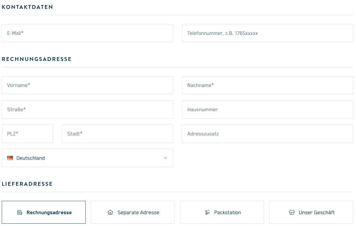
Beispiel für gruppierte Daten im Bestellprozess
Bonus: What is the 6-3-1 rule in UI design?
The 6-3-1 rule is a tried-and-tested principle that helps you to structure user interfaces clearly and logically. It ensures that menus and pages are clearly structured - so users can find their way around more quickly and don't lose track. Good orientation is particularly important for websites and apps: if you don't immediately understand where you're going, you'll quickly leave.
With the 6-3-1 rule, you can keep the common thread - for a tidy, intuitive interface that noticeably improves user guidance.
What is behind the 6-3-1 rule?
6 main items in the menu: More than six items at the top level overwhelm the user - especially with mobile interfaces. These points are central decision factors for the overview.
3 navigation levels maximum: Deeply nested pages are difficult to keep track of. Three levels are sufficient in 90% of cases.
1 primary action per page: Each page should have a clear goal - not three competing call-to-actions. This directs the focus and increases conversion.
If you stick to this principle, you automatically ensure greater clarity, better understanding and a straightforward user experience. This reduction rule is particularly worthwhile for complex applications with a lot of content. Interface designs and the selection of the right elements make a significant contribution to providing users with a clear overview and a good overview at all times on a website or app.
What other principles apply to UI design?
In addition to Shneiderman's rules, there are other internationally recognized design principles - such as Jakob Nielsen's heuristics (also known as usability heuristics) or the ISO standard 9241-110. These principles help you to make fact-based design decisions, even when they are more complex.
Some of the most important supplementary principles:
Task appropriateness: the UI should directly support the user's goals, not hinder them.
Self-descriptiveness: In the best case scenario, each function is self-explanatory - without training or instructions.
Ease of learning: Recognizable patterns promote rapid familiarization.
Fault tolerance: The system should be robust against incorrect operation - and if necessary, respond with clear correction options.
Controllability: The user determines the process - not the system.
Customizability: Where appropriate, the interface should be adaptable (e.g. dark mode, language, font size).
These principles apply across all industries - whether it's software, web applications or mobile apps.

Schneidermans Regeln haben sich im UI Design durchgesetzt
How should the color ratio in UI design be structured?
A tried and tested rule of thumb for color design is 60-30-10. This principle originally comes from interior design, but also works excellently in digital design.
Here's how it works:
60% primary color: dominates the layout, e.g. white, light grey or a subtle CI blue.
30 % secondary color: supports structures, e.g. for backgrounds, boxes or sections.
10 % accent color: highlights buttons, links or active elements (e.g. orange, red, turquoise).
In addition to the ratio of colors, the properties of the colors and UI elements used, such as saturation, brightness or transparency, also play an important role in the overall image.
This distribution ensures visual balance, prevents sensory overload and draws the eye to the essentials. The accent color should be high-contrast - but used sparingly. It must not be "used up".
Tip: Ensure sufficient contrast (at least 4.5:1 for text) in accordance with the Web Content Accessibility Guidelines (WCAG).
What is included in a complete UI concept?
A UI concept is more than just a design idea - it is the strategic blueprint for the entire user interface and encompasses the process of designing an effective and user-friendly UI concept. It combines insights from target group analysis, technology and design and ensures that everyone involved is working on a common basis.
A complete UI concept should include
Target group analysis and personas Who uses the application? What are their needs, habits and challenges?
Use cases and user paths What goals are to be achieved? How do users reach their goal? What dropouts are there?
Information architecture How are content, functions and navigation points structured?
Wireframes and prototypes Visual drafts of layouts and processes - for internal discussion or user testing.
Design system and style guide Colors, fonts, components, states (e.g. active/inactive), responsiveness, icon language.
Interaction behavior What happens on hover, click, scroll or swipe? How is feedback given?
Accessibility strategy How are contrast, keyboard navigation, screen reader compatibility and alternative content implemented?
A UI concept creates clarity - internally in the team and externally in the implementation. It is the basis for consistent design throughout the entire life cycle of a product.
Conclusion: Good UI is no coincidence - but strategic craftsmanship
A good user interface is the result of well thought-out decisions. It is based on proven rules, clear principles and a deep understanding of the user. The interaction between humans and computers is at the heart of this.
Shneiderman's eight golden rules provide a solid foundation for this - supplemented by modern structural approaches such as the 6-3-1 method.
Those who take these guidelines to heart not only design beautiful interfaces - they also develop systems that work, create trust and are a pleasure to use. Interfaces that present the product in the best possible way, provide clear feedback and fit seamlessly into the user's everyday life. Because in the end, it's not the technology that determines the success of an application - it's the impression it leaves on the user.
Do you want to make your digital interfaces more intuitive, accessible and effective? Then get in touch with us - we will support you in developing a UI/UX design that inspires people and achieves goals.
FAQ - What rules are there in UI/UX design?
Good design principles include consistency (internal & external), accessibility, immediate and informative feedback during user interactions, clear structuring of processes with beginning, middle and end, error avoidance and comprehensible error messages, undoing of actions, user control and the relief of short-term memory. These principles ensure that interfaces are not only aesthetically pleasing, but also intuitive to use and reliable.
The 6-3-1 rule helps to make menus and navigation clear by specifying the following: a maximum of 6 main menu items, a maximum of 3 navigation levels, and one primary action per page. This simplifies the information architecture, makes user guidance clearer and reduces confusion or excessive demands.
Accessibility is achieved through measures such as sufficient color contrasts, alternative texts for images, keyboard navigation, understandable language and consideration for people with motor, visual or cognitive impairments. In addition, accessibility should be considered from the outset and integrated as part of the design system, not as an afterthought.
Feedback and feedback ensure that users know that their input has been recognized, what the current system status is and whether their action was successful or error messages occur. Visualizations such as hover effects, loading indicators or success messages help to avoid uncertainty and misunderstandings.
Errors can be avoided by using
Input help and automatic formatting (e.g. telephone or zip code fields)
Deactivating options that are not available
Clear and understandable error messages that say what is wrong and how the error can be corrected
Dynamic feedback during input, instead of after submission
Short-term memory is limited, so the interface should keep information visible, show hints directly where they are needed, group content logically and avoid repetition. Features such as tooltips, visual markers and auto-completion support users without them having to remember too many details.
A complete UI concept typically includes target group analyses and personas, use cases and user paths, information architecture, wireframes and prototypes, a design system or style guide with colors, fonts and components, information on interaction behavior (such as buttons, hover, click feedback, etc.), as well as an accessibility strategy.
Supplementary principles are task appropriateness (the UI directly supports the user's goals), self-descriptiveness (features explain themselves), ease of learning (recognizable patterns), fault tolerance (system reacts robustly to incorrect input), controllability (the user has control) and customizability (e.g. settings, adaptation of layouts or styles).
